BALANCE - the distribution of “weight” (actual weight or visual weight)
The CTRL+PAINT video does a great job of introducing the principle of balance, but there are a few more things I’d like to cover.
Actual Balance vs. Visual Balance
The video discussed only visual balance (the apparent balance we see in two-dimensional works), but some three-dimensional sculptures possess actual balance.
The Spear Bearer has balanced his bent knee on one leg by the jutting of the hip on the opposite leg (a pose known as contrapposto). He looks natural, relaxed, and balanced. The tree stump on the figure’s right would also have been balanced by the spear that was once present in the figure’s left hand.
We can basically think of balance in terms of opposites. If something “heavy” (like the tree stump) exists on the bottom left, then to be balanced something ”heavy” must exist on the top right (the missing spear).
Symmetrical and Asymmetrical Balance
There are two basic forms of balance: SYMMETRICAL BALANCE and ASYMMETRICAL BALANCE.
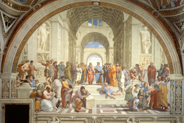
Symmetrically balanced compositions are nearly identical on either side of an imaginary line (or axis) that divides the composition in half. This type of balance is also known as formal balance.
Raphael, School of Athens, fresco, 1509-1511
Each of the compositions above is nearly identical on either side of a vertical axis that runs through the center of the work.
Asymmetrically balanced compositions cannot be bisected by an imaginary axis but are still balanced by size, placement, value, and/or color. This type of balance is also known as informal balance.
Take this painting by Amy Sillman. It is not symmetrical, but it still has an even distribution of visual weight.
There are two black shapes on the left, concentrated near the bottom, which are balanced by two black shapes on the right, concentrated near the top (remember to look for opposites).
Likewise, there are overlapping faded shapes near the top center (mostly yellow and gray) balanced by overlapping faded shapes near bottom center (mostly gray, but I see a small bit of yellow repeated).
Now let’s look at how a more complex painting achieves asymmetrical balance.
Nicolas Poussin, Holy Family on the Steps, 1648, oil on canvas (source)
If we only look at the shapes and figures in this composition, it would appear to be pretty balanced. All five of the figures (the three adults and two children) are centered in the painting.
Once we consider the lighting, however, this balance is thrown off. The man on the right (Joseph) is in very dark shadow, and all of the light hits the figures on the left (St. Elizabeth, John the Baptist, Jesus, and Mary).
If the lighting creates a heavy emphasis on the left side of this painting, how is it still balanced?
There is a complex interaction of value, color, and placement that creates asymmetrical balance in this painting.
LIGHT AND DARK: Joseph is extremely dark and in shadow, but he is balanced by the dark orange tree and shadows behind the columns on the left side of the composition.
The women and children are the brightest figures, and located on the bottom left, but they are balanced by the bright sky and clouds located at the top right.
Joseph’s foot is actually being hit by light, leading our eye back over to the right and connecting him to the group of figures.
Color also plays a large role in the balance of this painting.
COLOR: Red carries more visual weight than other colors. The red in this painting is concentrated in the center (think of the fulcrum analogy from the video).
The golden yellow of St. Elizabeth’s robe is repeated on Joseph’s foot and in the clouds in the sky.
The blue of Mary’s robe near the bottom of the composition is balanced by the blue of the sky above.
Finally, let’s look at the placement of objects.
PLACEMENT: Notice the ledge below the group of figures. Sitting on the ledge is a basket, an urn, and a box. On the left, where the figures appear most “heavy,” there is only one object – the basket. On the right, where there are fewer figures and shadowy values, there are two objects – the urn and box. More objects on the right help bring more visual weight to that side.
Imbalance
Finally, not all compositions are balanced. Sometimes, and artist intentionally uses IMBALANCE to create an uneasy sensation.
Philip Guston, Transition, 1975, oil on canvas (source)
Philip Guston wants you to feel uneasy when looking at this painting. The subject matter is unpleasant. The colors resemble raw meat, there seems to be a pile of feet and hands, and a guillotine sits in the bottom right. The imbalance aids the uncomfortable subject matter.
Michael Heizer, Levitated Mass, 2012, Los Angeles County Museum of Art
The precarious balance of this large boulder is intended to give the viewer an uneasy sensation as they pass underneath.


